Part 2 of the design process

Research possible solutions

Learning more about the context, competitors in the space, users and possible solutions from outside the industry

Learn more

Research avenues


The context

Fully understanding the environment and usage case for the UI is critical before embarking on UI design

Learn more

Competitors

Researching rivals and competitors approach to the problem can often be insightful, if only for what not to do

Learn more

Userbase

Designing a solution for the potential users would be impossible before learning more about them and their motivations

Learn more

Possible solutions outside industry

Before sketching anything, it is worth seeing what similar solutions are already being used, not being limited to competitors

Learn more

The context

Understanding the market and industry

As a frequent Shazam user myself I am familiar with the environmental concerns worth factoring when using the product. (Due to lack of real market research the following is based off personal experience)

Typical Shazam environment

Findings


Clarity is key

The app is used in variety of often chaotic (bars, clubs, parties) environments where the user wants the quickest return of information in the minimum amount of time. This applies to Artist profiles.

Stand out! Users don't browse

Users of Shazam fall into the 'pick up, put down' category of users. Opposed to the idle scrolling of Instagram, users come into Shazam for a purpose. And want that purpose served as efficiently as possible.

Users are often with friends

Music is a social pastime and Shazam is loved by many for it's ability to connect people over new music. It would be unwise to ignore this in the designs.

Competitors (Or Partners)

Knowing the industry norms

Spending a bit of time analyzing competitors apps and their solutions to the problem is always useful to see if their product fit is any better than ours. With no direct competitor focus here is on mobile device apps that Shazam may partners with but are moving into their space with the discovery element.

Findings


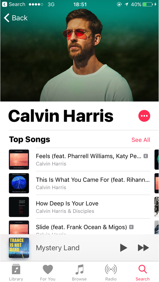
Apple Music

Often hailed as a UX disaster their Artist profile pages offer little of interest apart form the list of sngs.

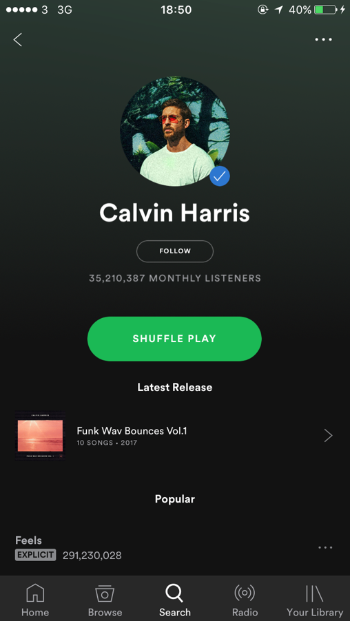
Spotify

Integrating stats, follow buttons and verified users into their artist pages gives SPotify a social network element akin to Shazam.

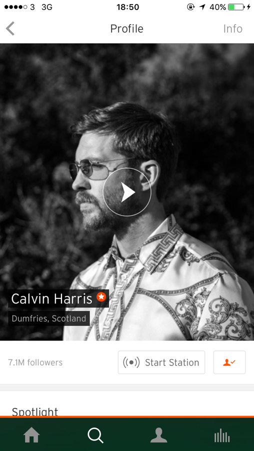
Soundcloud

Unique to spottily is their 'Start Radio' button which starts a similar artist playlist.

Userbase

Learning more about potential users

The most important element of research was understanding potential users and how they currently use Shazam. I did this through chatting to several friends of mine who have used Shazam.

Typical Shazam environment

Findings


Selected quotes from prospective users

"I honestly didn't know Shazam had artist profile pages, but it makes sense that they do have them...not sure I'd be interested enough to follow."

Drew Jackson, Shazam user

"I thought it was pulling in a twitter feed when I first saw it as it looks so similar. Can users post whatever they want to their own page too then?"

Kaspar Iskjær, Shazam user

"It would be great if you could read more about the artist. Especially if it is someone you've never heard of. Perhaps a little bio page?"

Nikki Anderton, Shazam user

Other possible solutions

Are there any UI patterns I can take from elsewhere?

Not limiting myself to just direct competitors the UI also takes patterns and ideas from areas outside the Music industry. The similarities to social networks caused me to explore the following in particular.

Findings


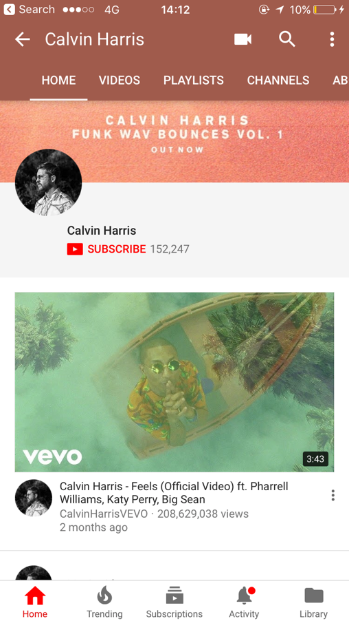
Youtube

Youtube relies on it's tabs to filter a wealth of content from each artist.

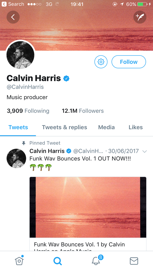
Twitter

Due to shared social posts, Twitter looks extremely similar to Shazam at the moment which can be confusing.

Snapchat

The success of stories and video content in particular in the last few years leads me to believe this is worth exploring.

Up next

Part 3 of the design process: Design

With a better knowledge of the context and potential users its time to start designing solutions.