From initial sketches to first prototypes ready for testing
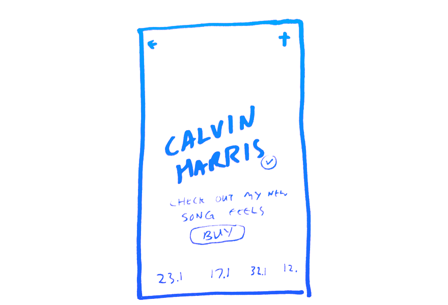
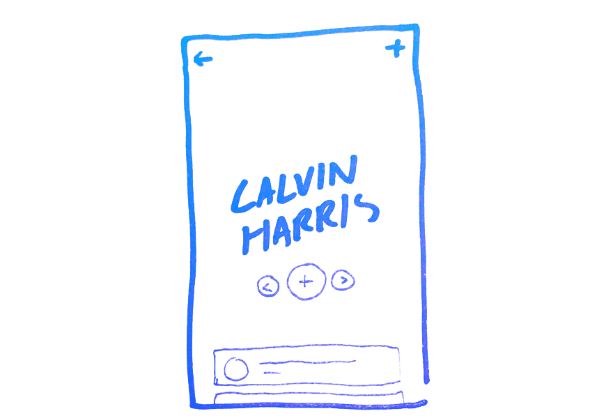
Learn moreScattered collection of initial thoughts
The design process isn't as linear as described above but it is similar, it actually begins as soon as the task is set. Initial ideas are jotted and sketched down and either rejected or reinforced by the aforementioned research.
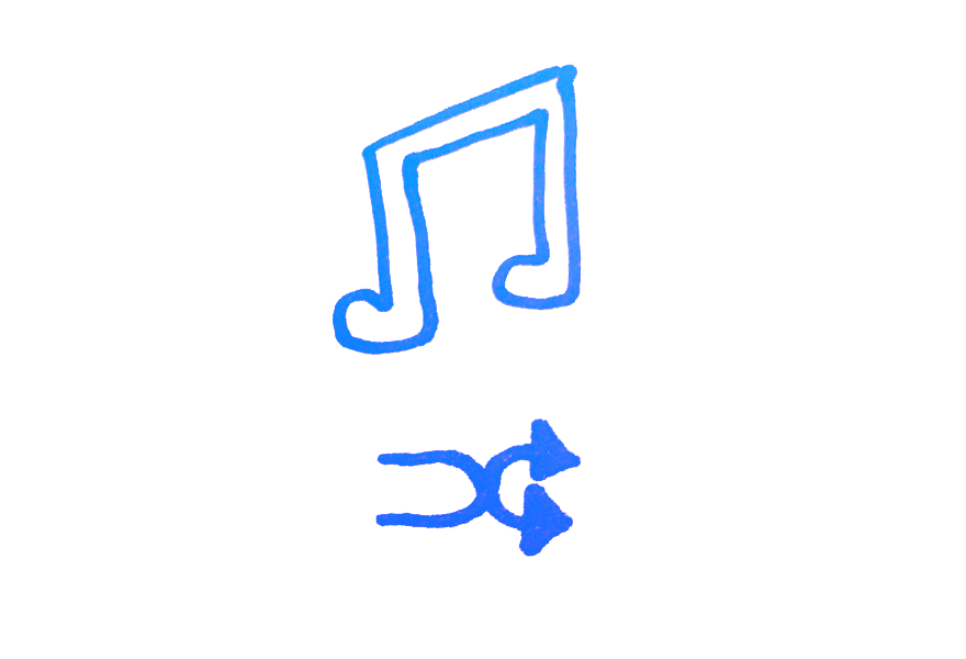
Discovery shouldn't finish on the artists page.
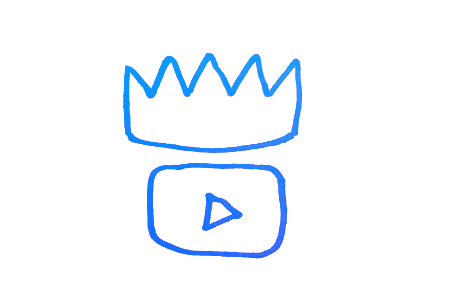
Video is king on the web, we should utilise it.
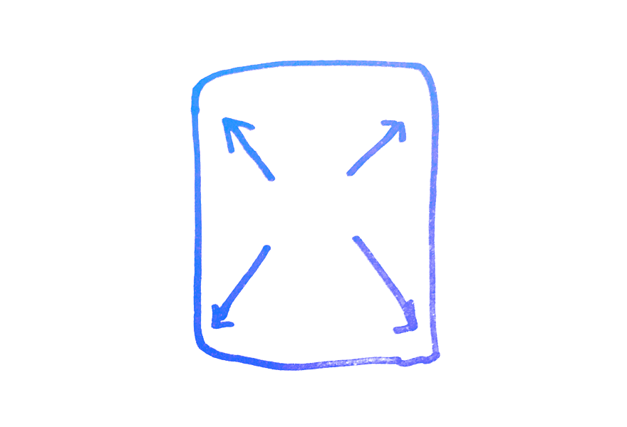
Make way! Phones are only getting bigger. Why limit ourselves to tiny boxes.
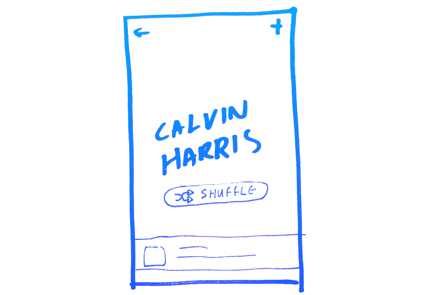
Connecting the dots
To ensure nothing has been missed from the initial design ideas all screens of the flow are sketched out to give a perspective of the userflow and the micro UI.
Shuffle artists button takes the suer to a random but related artist to keep the discovery happening.
Pinned area at header allows artists and brands highlight what matters to them most.
Use the artist profile page as the music player. Play, puase, skip and shuffle all from the header.
Thinking about component design early on
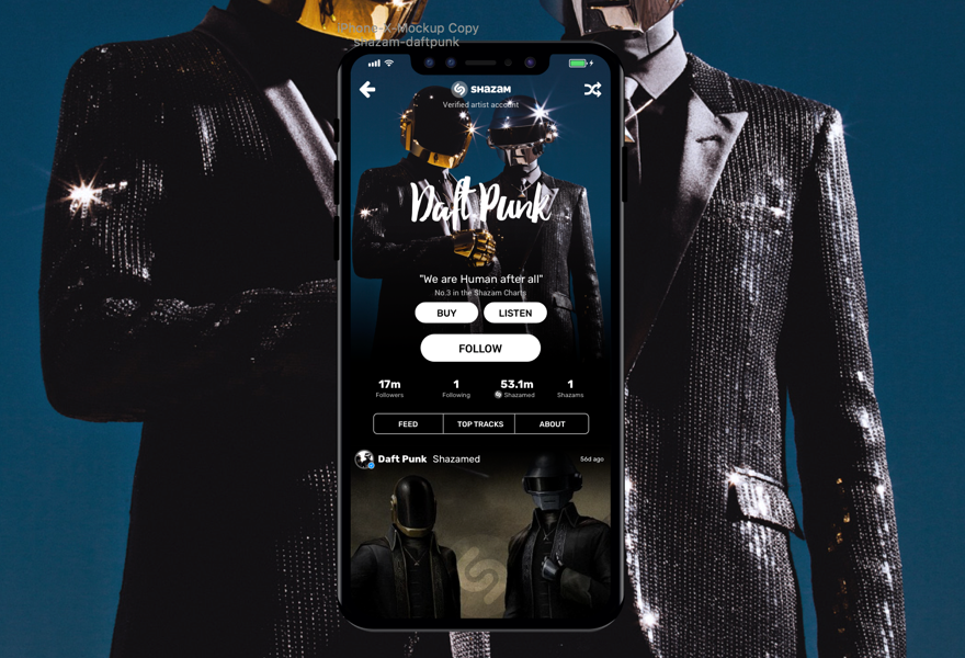
Testing designs that are not high fidelity can sometimes taint the reliability of the test. Therefore I dive into Sketch or Photoshop early on to mock up more polished and beleivable wireframes. With a well worn styleguide, this process is often a lot quicker than creating wireframes.
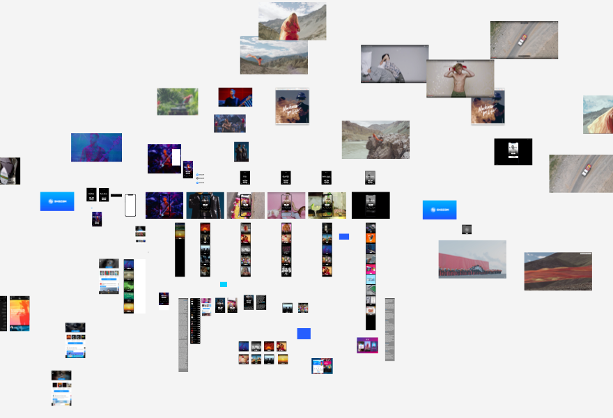
The organised chaos for the project in Sketch
Screenshot of a WIP artboard in Sketch
Close up of the feedcard symbol
Transforming the polished flats into a believable connected system
Creating a working prototype is the best way to test design ideas on real users, with tools such as invision and Marvel it can easily done in minutes. In this case I decided to use HTML/CSS as to incorperate video and audio, key to the ideas success.
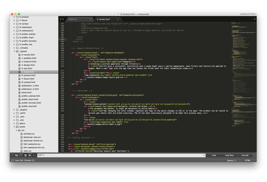
Coding in sublime
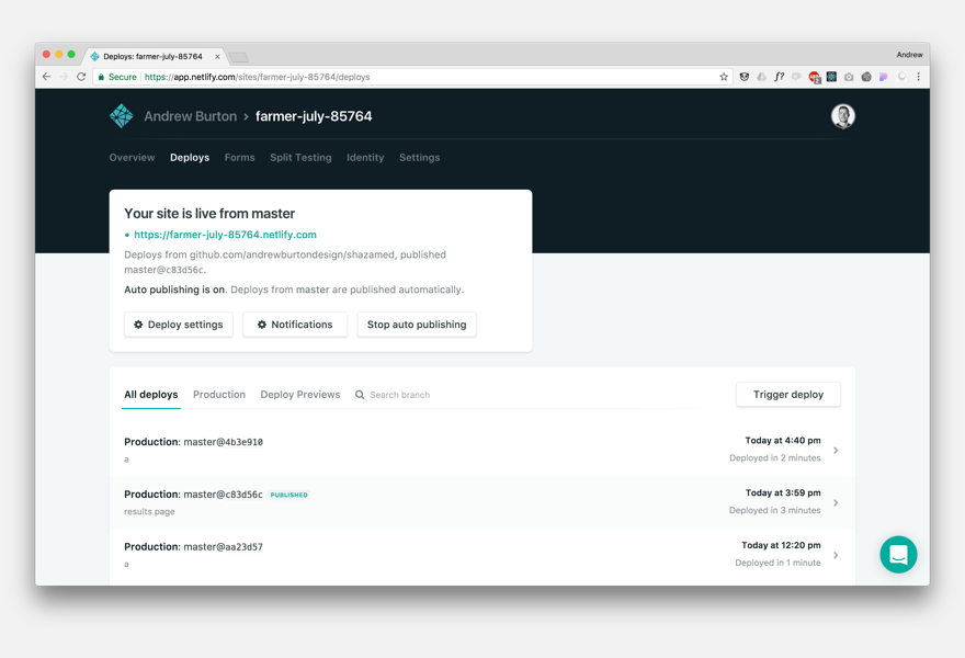
Hosting and deploying through netlify
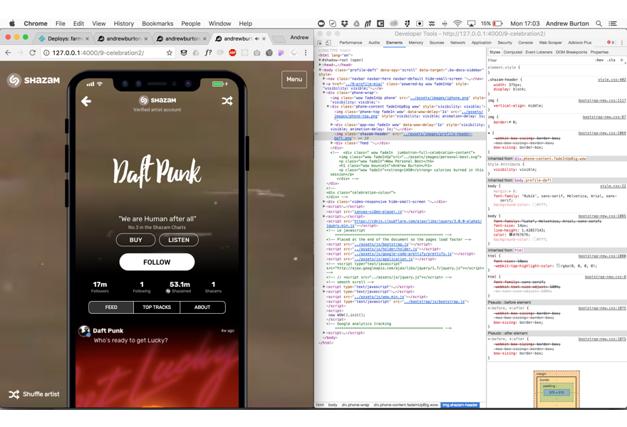
Bug fixing and optimizing for all screen sizes
Check out the HTML prototypeWhilst designs are progressing I ensure to get constant feedback from my team members (in this case I used my friends again)
"Love overlaying the video with the feed"
"Quite hard to read the top bit"
"Shuffle button is cool"