Part 5 of the design process

Implementing the visual aesthetic

Using the conclusions of testing to improve the app through visual design consolidation

Find out more

Using Shazams Brand


Unifying the visuals and experience

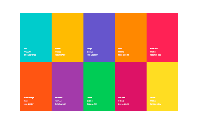
For a visually consistent look and a product that fits the context, it is important to spend time on the a consistent and stretch tested brand. Luckily the work has already been done for me with extensive Shazam brand and style guidelines. For the purpose of this exercise I spent the majority of my time on the product UX as opposed to the branded UI. For this reason I kept to the styleguide for the most part except in a few areas of 'style evolution'.

Moodboard


Shazam styleguide

For the most part this was a UI evolution (not revolution). Instead of worrying too much about rebranding the product I decided to focus on the user experience.

Artist image assets

On the artist profiles I wanted to scale back the Shazam brand and allow the artist's (and brands) to shine through instead.

Video is king

Most artists create expensive and visually stunning videography. This content boosts interaction and would be a shame not to utilize.

Back to black

To allow artists brand and video to shine through, the UI is darker and subdued. This also helps distinguish it from feeds on Twitter et al.

Brand


Logo

As can be expected, the logo and primary colour hasn't been revised for the purpose of this task. As an extremely recognisable and loved brand this would never be recommended by myself.

Colour

Using the Shazam guidelines as jump off point I added a few darker colours for UI on the artist profile.

Typography 1

Debby was chosen for the artist name's font to give a bespoke, personalised and unbranded appearance to their page. This could be swapped in future for their logos.

Typography 2

Without access to Circular I decided to use Rubik as the primary font. It's bubbly and adaptable style seemed to go well with the Shazam brand. Plus it is free...

Imagery and video

Allowing artists brands to shine through

Full width images and videos allow for maximum brand penetration and minimal UI interference. As artist's and brand's most powerful marketing assets, it's important to let them take center stage.

All together now

The intent was to give the brand back to the profile owner

Attempting to create a scalable Artist profile page that relies on unique colours, illustrations, or Shazam chosen imagery is unrealistic.
It is a better model to step back and let users make their own decisions in an exciting manner.

Revising layouts post testing


Making visual adjustments post testing

It is important not to completely discard previous work after user testing. As the sample size was very small, subjective and extremely fast, there is no element of certainty in the results. Regardless I did expand the visual direction with this information.

Up next

Part 6 of the design process: Presentation

The design and prototype are now ready. So it's time sell it through presentation.